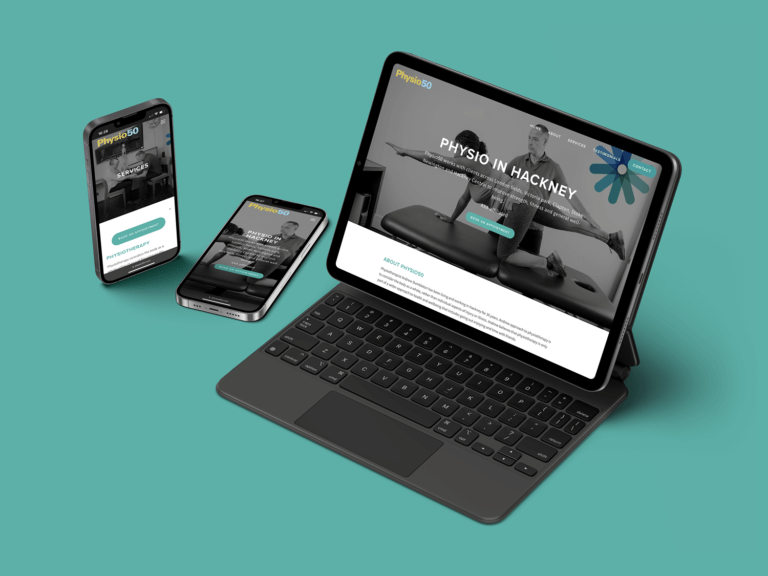
What is responsive web design?
Responsive web design adapts to a user’s device and screen size. When a website isn’t responsive, a mobile visit may appear as though everything is jumbled up, the text is too small, the images are cut off, the menu is impossible to navigate… the list continues. Meanwhile, a responsive website aims to provide a great user experience, regardless of whether you’re viewing the site on a small phone or a large monitor. The normal user experience principles apply, such as accessibility and loading speed.
In 2023, every website should be responsive. If yours isn’t, you’re likely losing potential customers. 61% of internet users have a higher opinion of companies with mobile-friendly websites. If a visitor visits your site on mobile and it is poorly designed, or worse, not at all functional – would you expect them to return to the same website on a computer, or simply find another site on their phone? They would likely choose the second option, which is why responsive design is crucial.
Why is responsive web design important?
This is an easy question to answer: In 2021, 54.8% of internet traffic came from mobile devices. Without a responsive website, you may lose that percentage of your users within seconds of their visit. As a result, your profits are likely to take a big hit.
If the majority of your traffic comes from computer browsers, you may decide to ignore responsive design, and instead, focus on making your browser experience as good as possible. While this is an understandable stance, your traffic is still likely to suffer because of it. Google recognises the importance of responsive design, so its search rankings will prioritise mobile-friendly websites. Responsive design is therefore an important aspect of SEO optimisation.

How can I make my website responsive?
The process of making your website responsive depends on a number of factors. One is the platform you used to build it. Most theme templates on sites like Squarespace and Wix will be responsive by default. You likely just need to make some minor adjustments in the design editor. As websites built in WordPress, for example, allow for more custom sites, they may require more work. Another factor is the complexity of your website. Inbuilt e-commerce, complex menus, animated elements and custom code are examples of such features. The quality of the build also makes a big difference. If the images are optimised and their position is percentage-based, for example, the process may be faster.
Not sure where to start? We’re happy to offer some advice – or a brand new website if that’s what you need! Because we recognise the importance of responsive websites, all of our sites are fully responsive by default. Once the site is built, we offer maintenance services to ensure it remains both functional and beautiful on all devices. If you sell products, we also offer e-commerce packages.
We would love to work with you to improve your website. Get in touch to learn more by email at matt@onemanwebdesign.com or by phone on 07983 570803.